
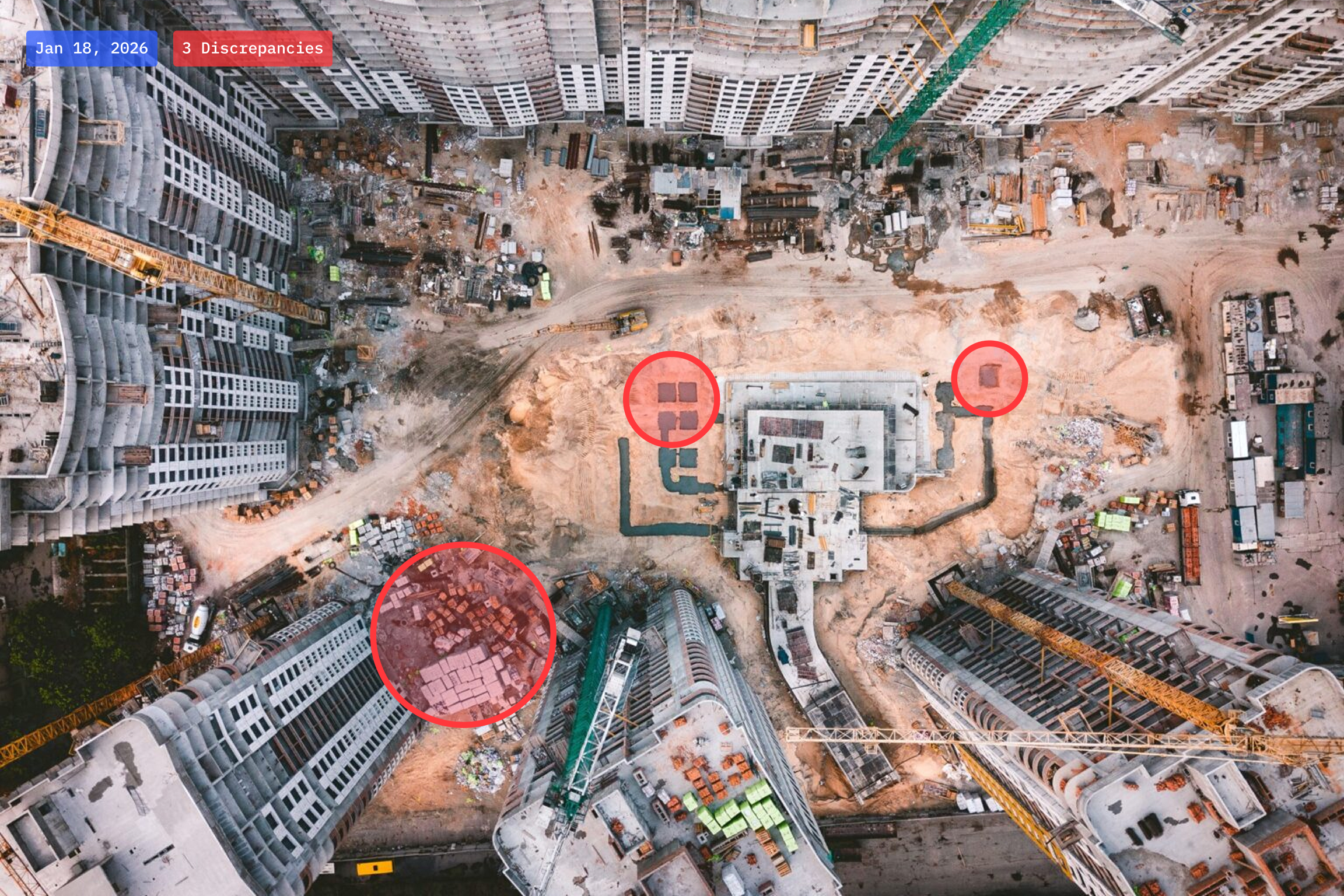
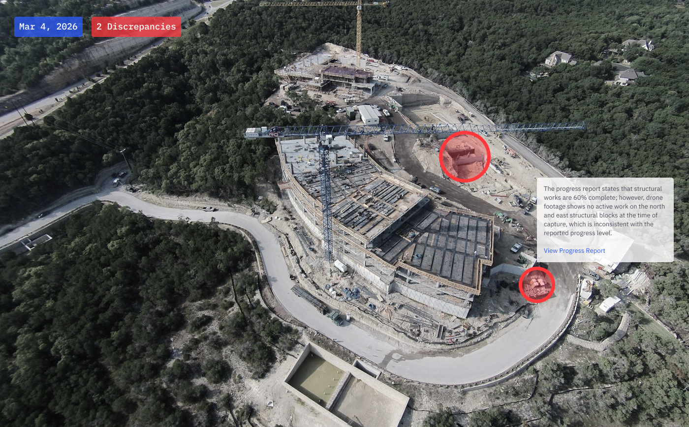
We began by defining the core features required to bridge the gap between reported progress and physical reality. Through deep-dive sessions with asset owners and investors, we mapped the specific friction points where project oversight typically fails. To ensure the platform could serve as a neutral source of truth, we conducted extensive workflow audits to understand how data from satellites, drones, and contracts could be cross-referenced to flag discrepancies. Because the tool is deployed in high-risk environments, we validated every interaction against the need for rigorous accountability.

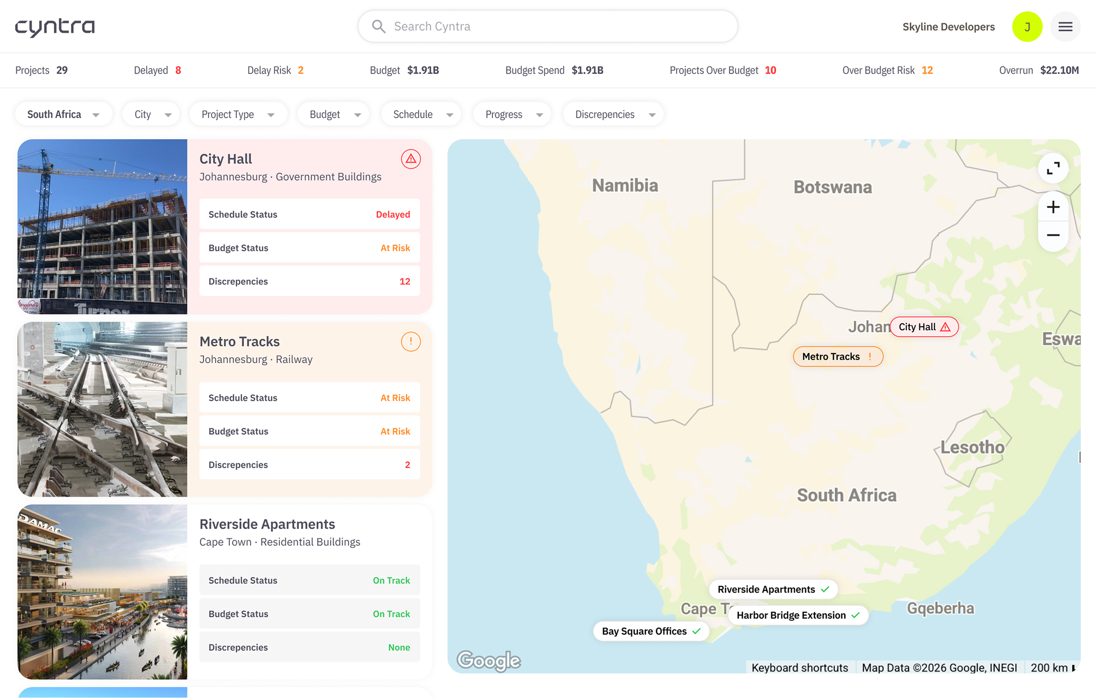
The cornerstone of the investor experience is an interactive geospatial command center that provides instant visibility across the entire asset portfolio. We designed a dual panel interface where geographic project mapping works in tandem with high priority status cards. This allows users to immediately distinguish between stable developments and those requiring urgent intervention. To handle larger portfolios, we engineered a full screen map view equipped with sophisticated filtering logic. Investors can drill down by project type, schedule health, or budget status, transforming a massive global footprint into a manageable and actionable stream of data.


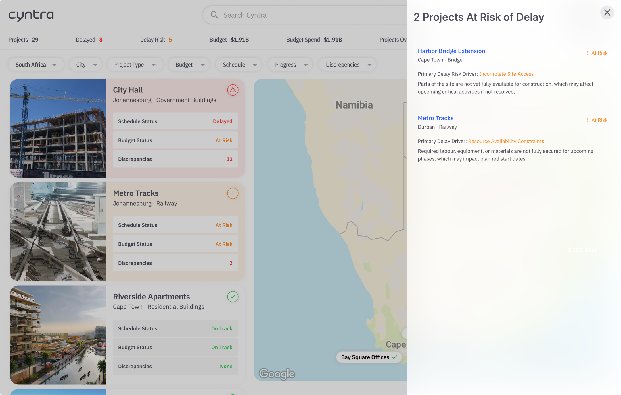

We established a visual language rooted in technical authority by utilizing the IBM Plex family. The combination of Sans, Mono, and Condensed weights allowed us to create a clear information hierarchy, using the monospace variant specifically for data points and coordinate tracking to evoke a sense of precision and "raw" proof. To maintain high visibility in complex environments, we paired a deep sapphire blue with a high-performance electric lime. This contrast ensures that critical alerts and status indicators remain impossible to miss, while the technical typography reinforces the platform's role as a sophisticated tool for modern oversight.

