
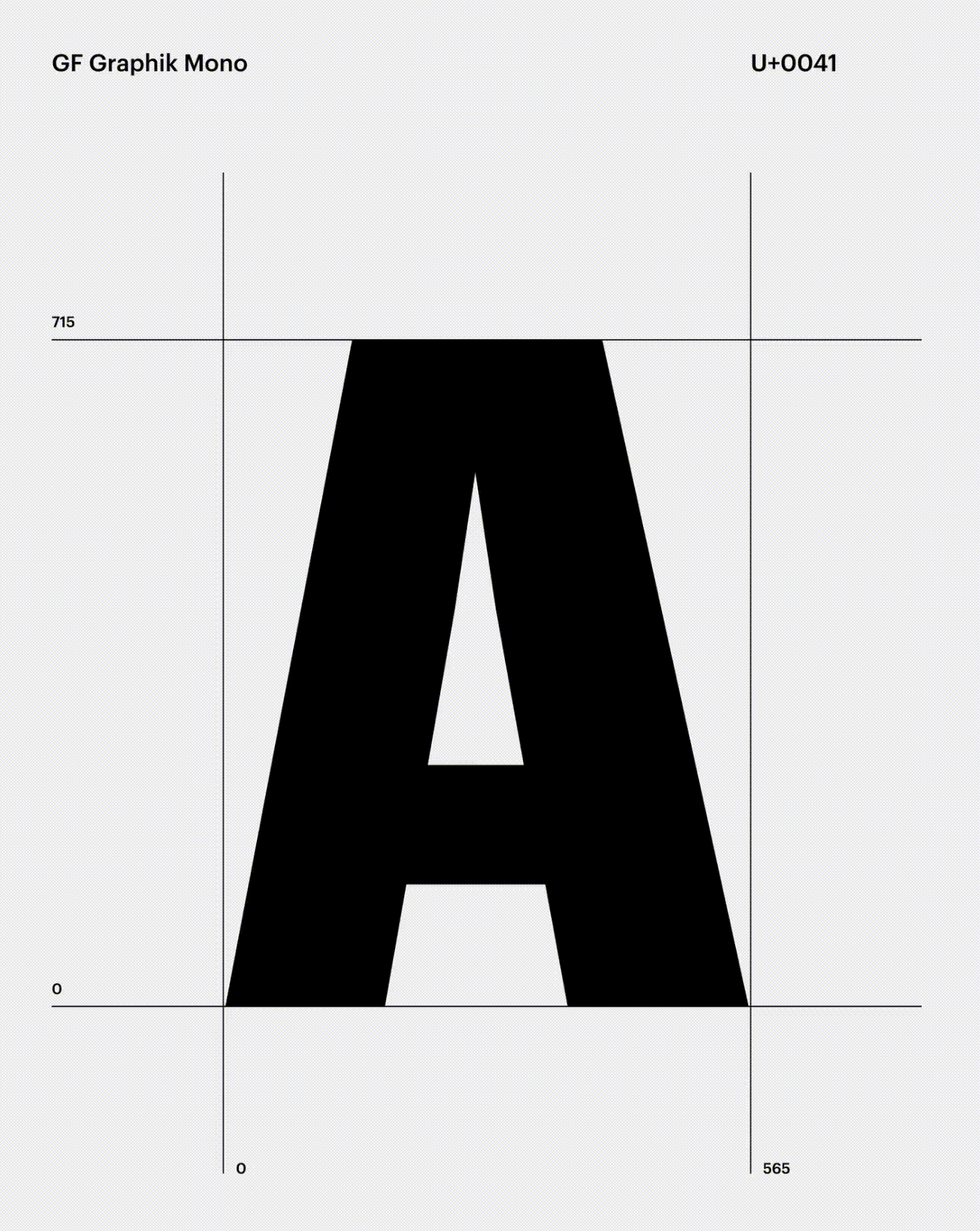
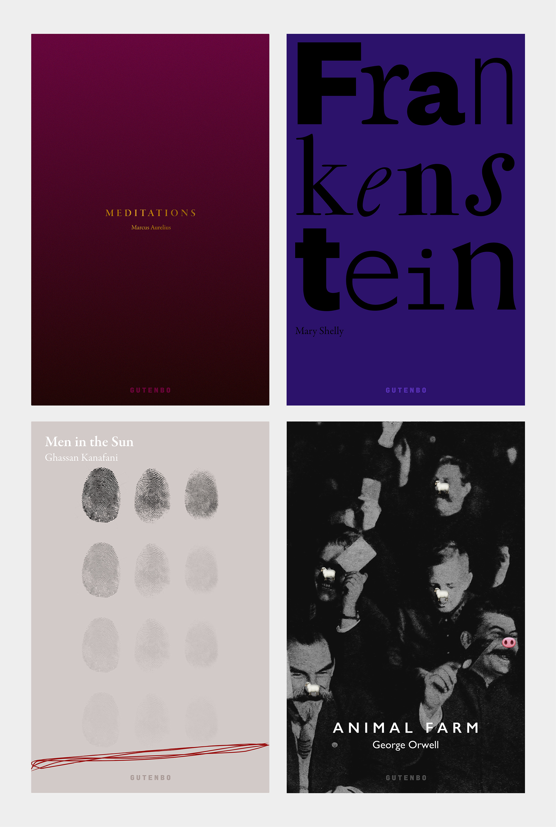
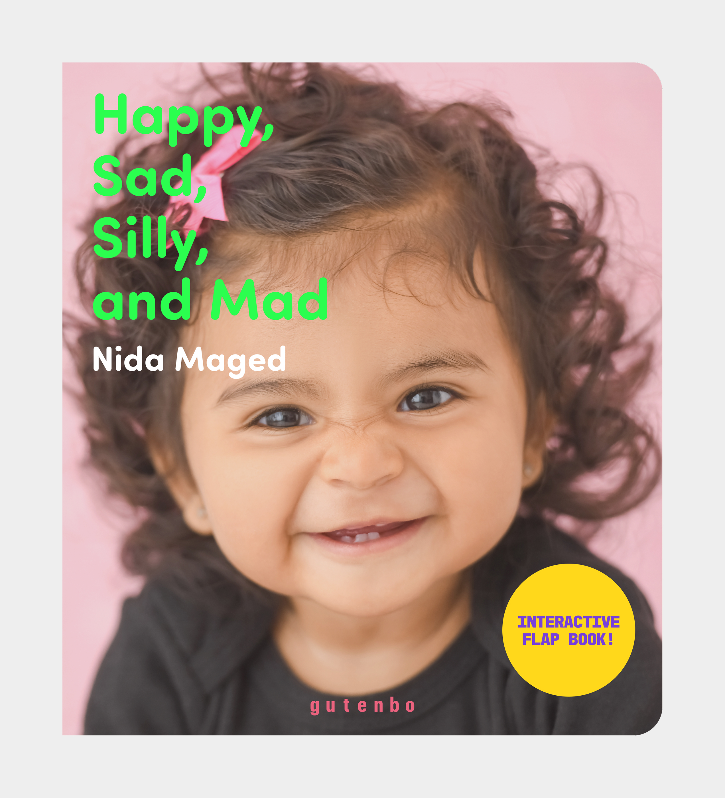
The logotype, set in a custom version of Graphik Mono, was expanded into a full typeface. This adaptation takes a technical, mono-spaced foundation and softens it for a more approachable feel. By using this single typographic system across both the classic editions and the children's series, we created a consistent visual thread for the entire studio. The result is a clean, functional identity that remains a recognizable and confident anchor on every cover.
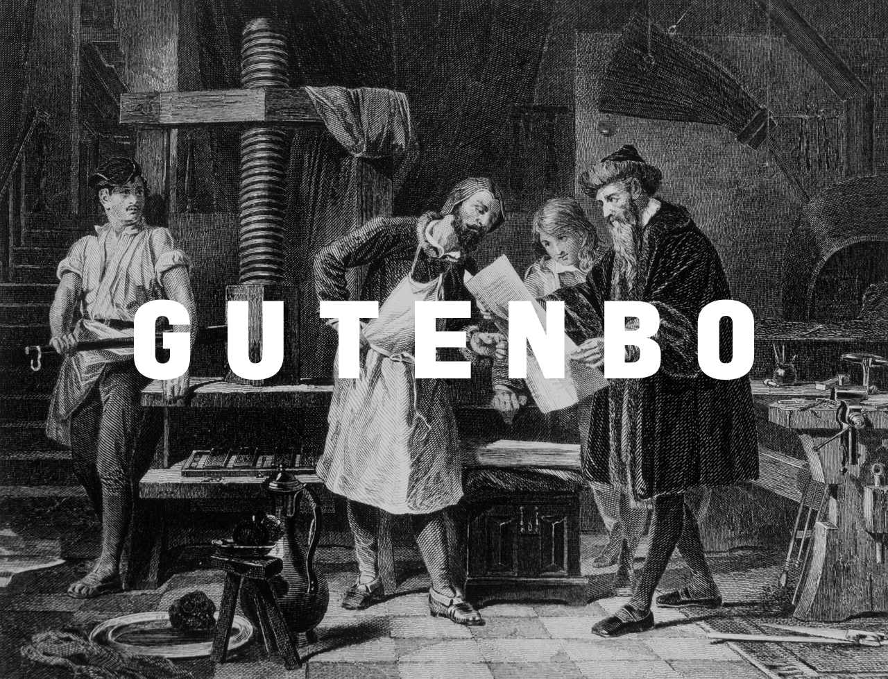
The covers for Gutenbo are designed to be seen as distinct objects rather than standard paperbacks. Each layout uses a specific typographic and graphic approach to reflect the spirit of the book, moving from the restrained gold foil of Meditations to the bold, oversized scale of Frankenstein. By avoiding the typical look of mass-market bookstores, the system treats every edition as a thoughtful piece of design. The result is a series of covers that feel permanent and considered, made to sit naturally in a modern home.
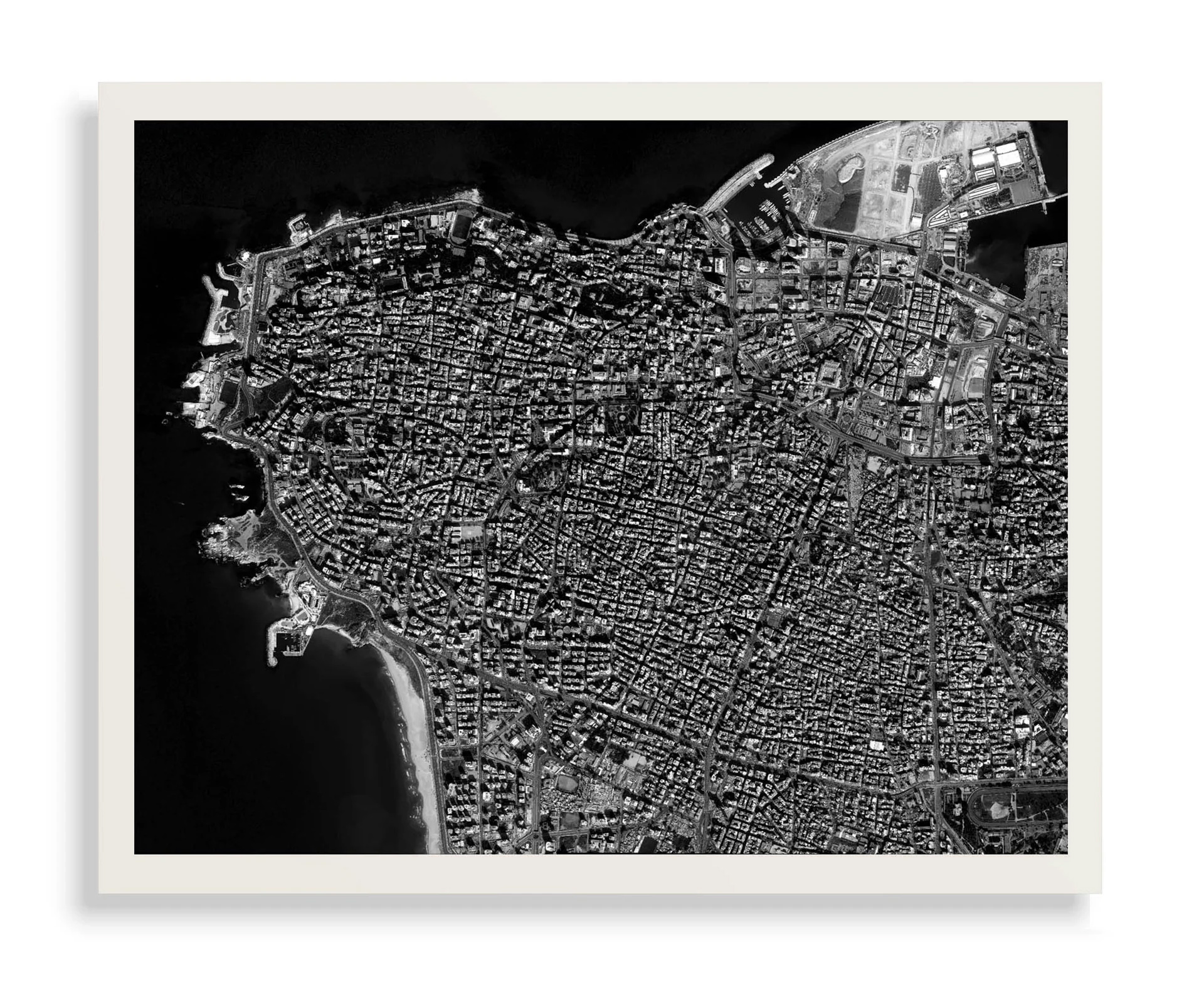
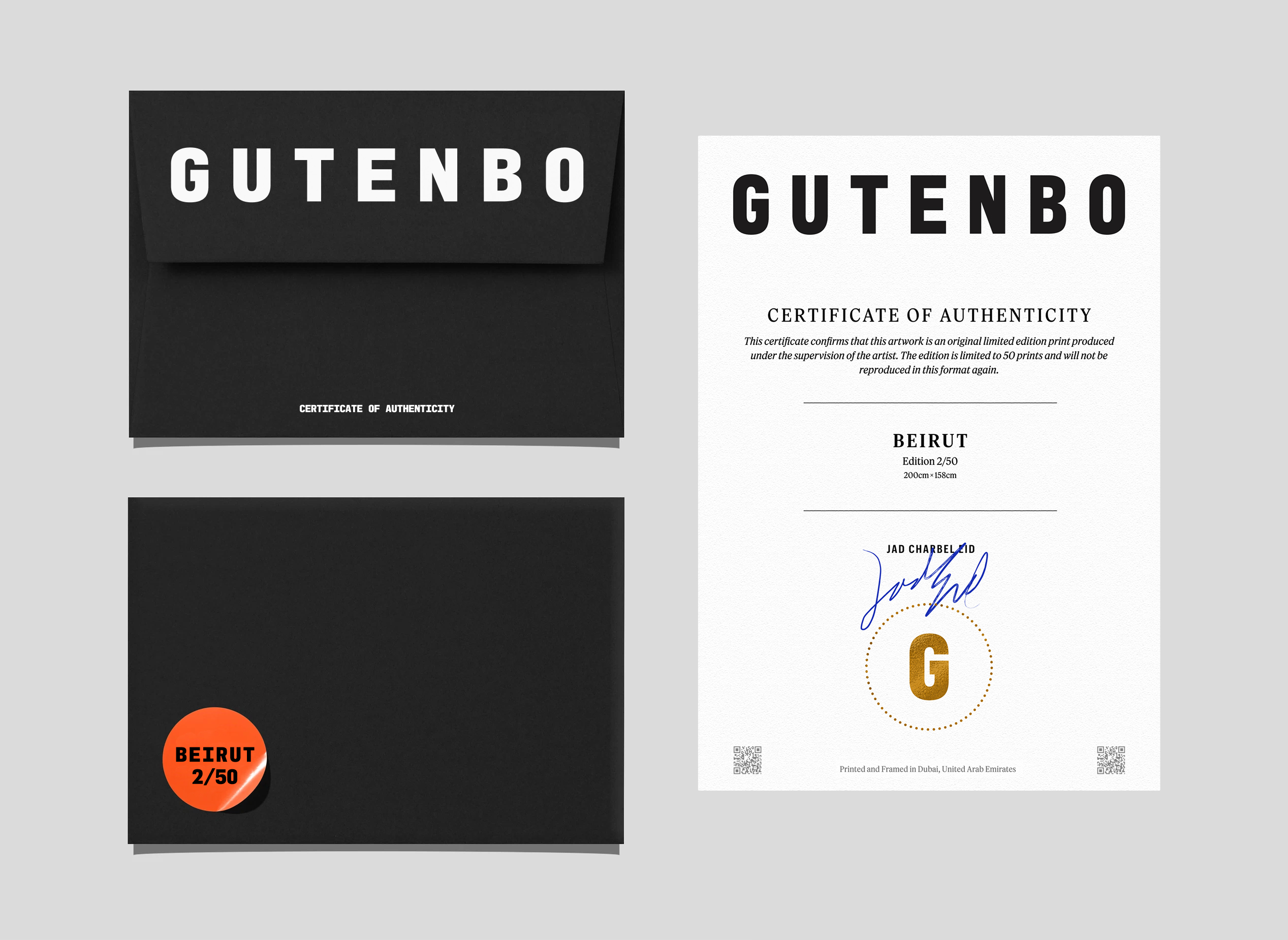
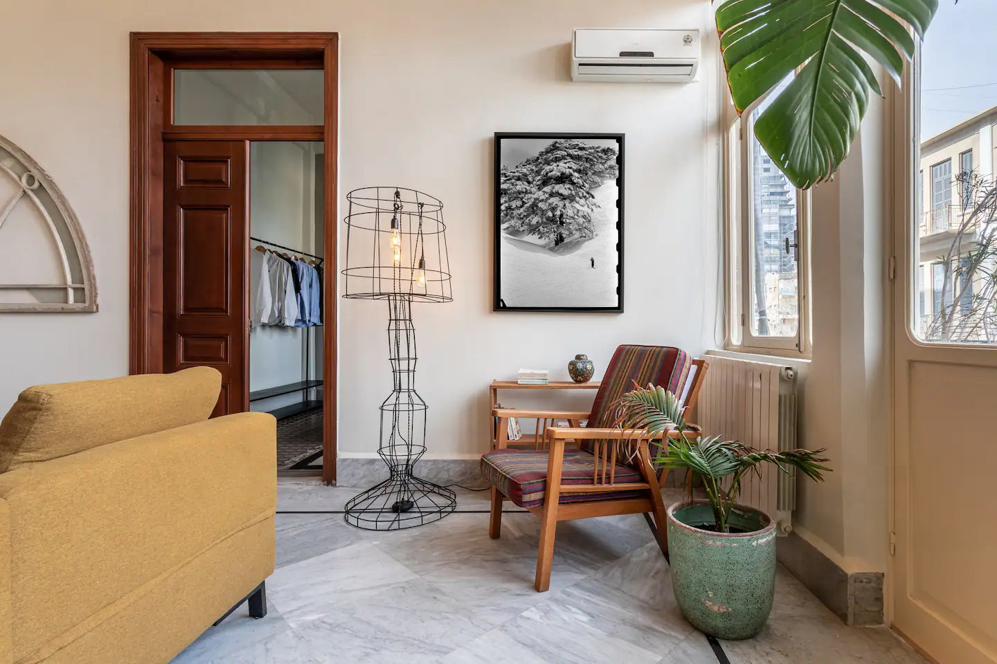
The digital prints extend Gutenbo’s design philosophy beyond the page. Each work is selected and composed with precision, balancing form, color, and negative space. Whether minimal and monochrome or vivid and graphic, the pieces are framed to function as structured visual objects. Moving away from decorative clichés, the collection treats wall art as disciplined design, made to live naturally in contemporary spaces.

The website introduces Gutenbo through a clear divide: Adults and Children. Each section carries its own visual language, from bold graphic compositions to playful illustrated forms, while remaining anchored in a unified typographic structure. Books and art prints are presented at scale, with minimal distraction and no promotional noise. The interface remains quiet so the objects carry the weight.
