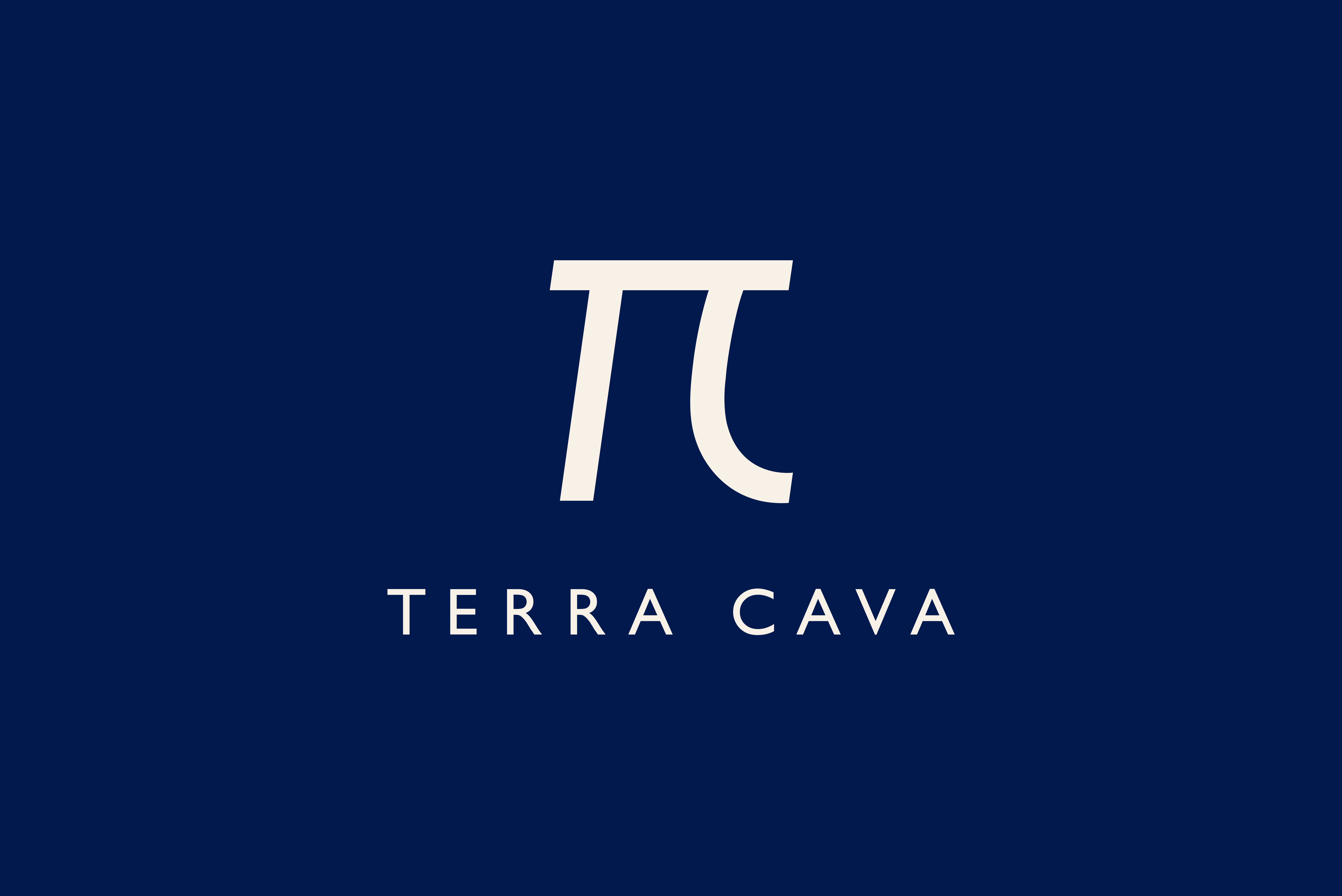
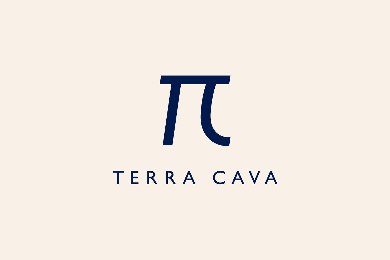
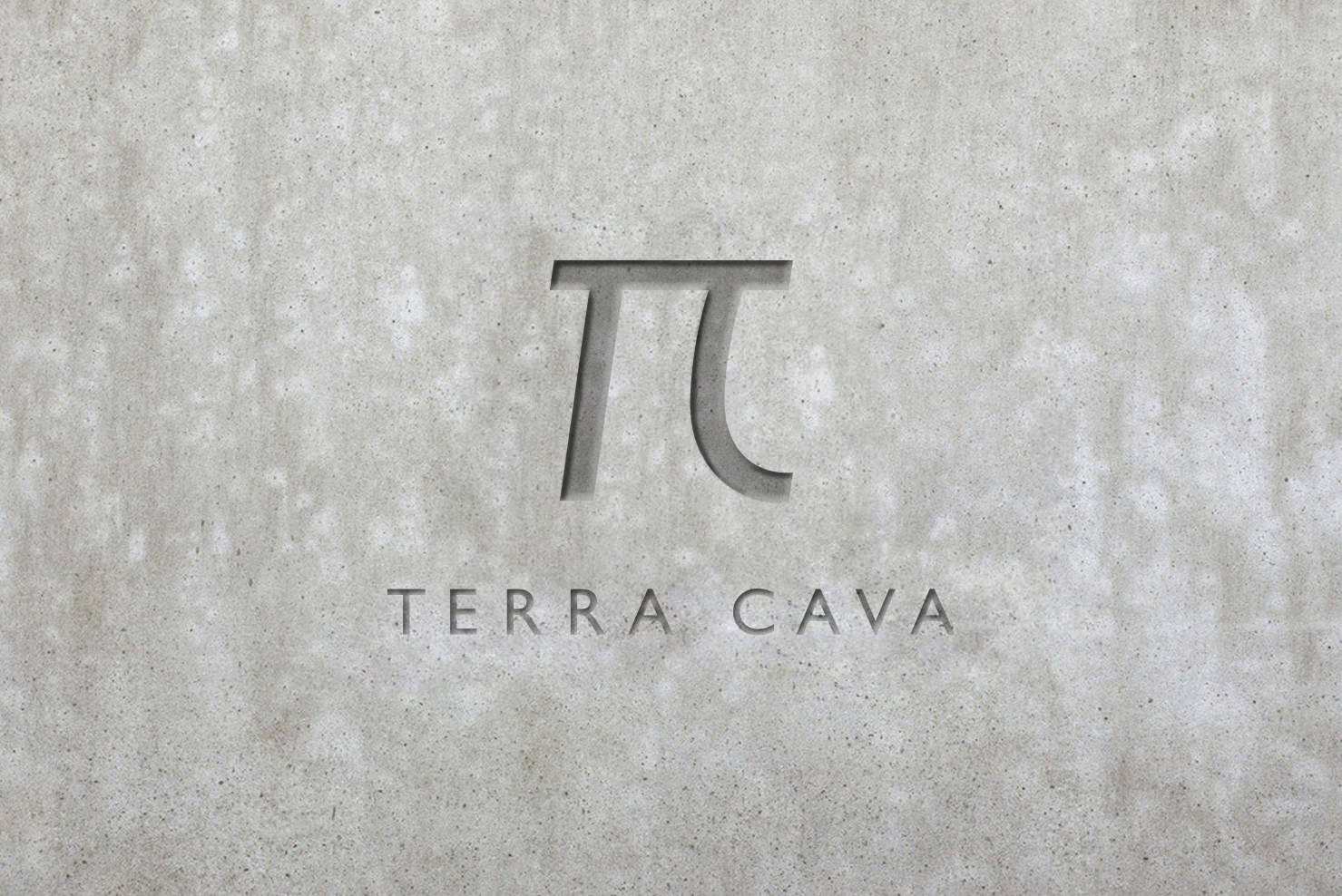

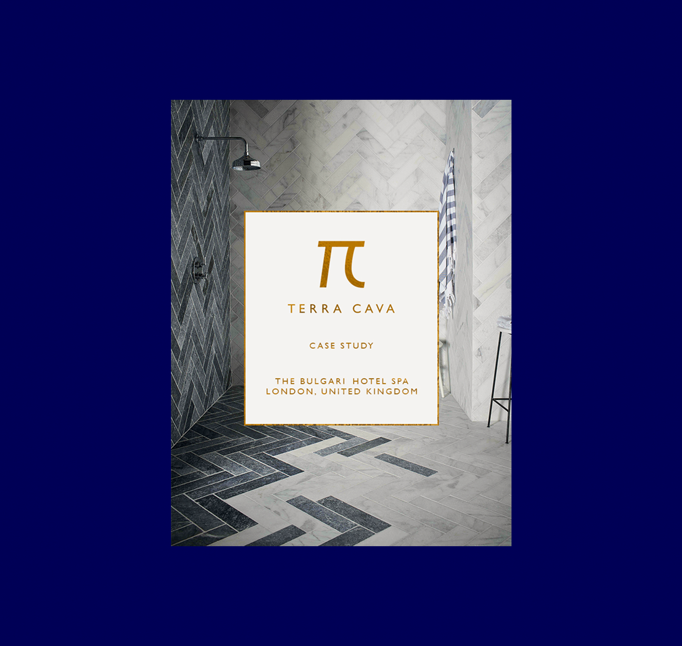

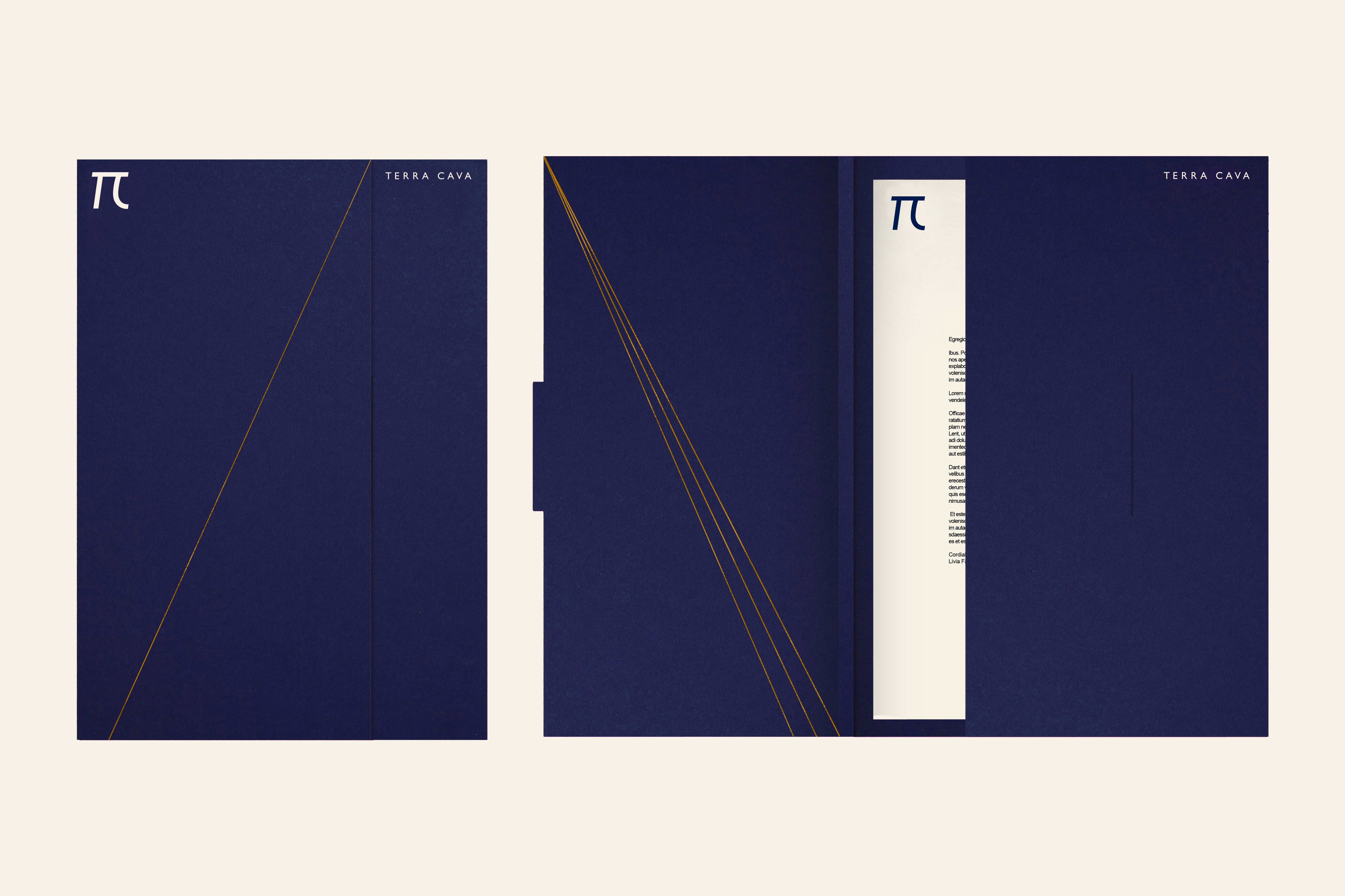
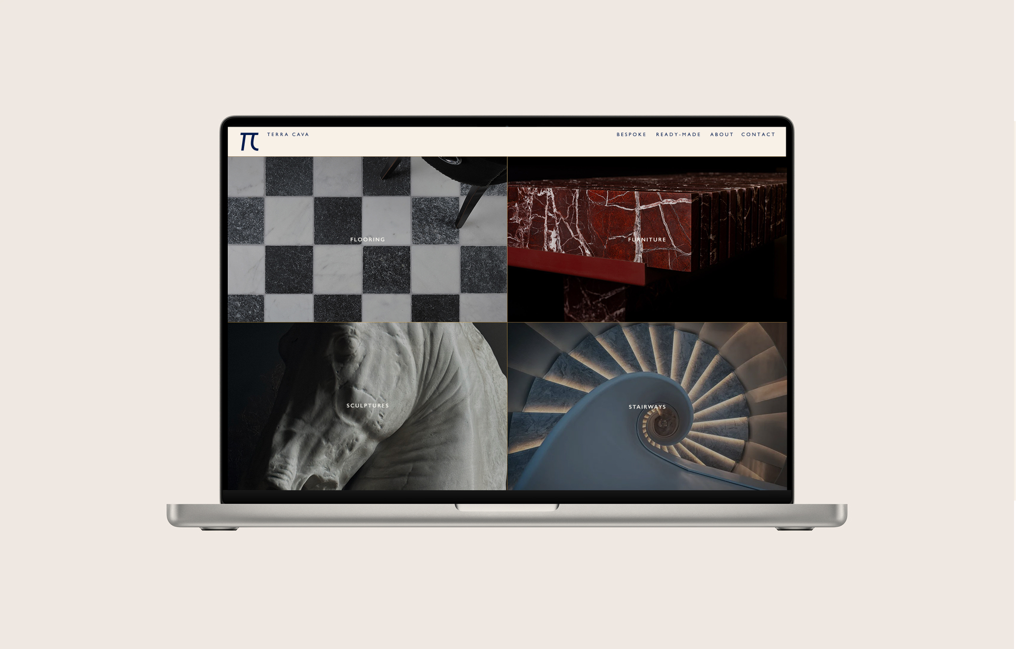
The Terra Cava logo was designed as a sculptural symbol rather than a decorative mark. Built around the form of π, the monogram reflects the balance between structure and curve that defines the brand’s work. Within this geometry, the initials emerge naturally, creating a mark that feels intentional, universal, and restrained. The result is a logo that communicates precision, craftsmanship, and modernity without relying on overt symbolism.
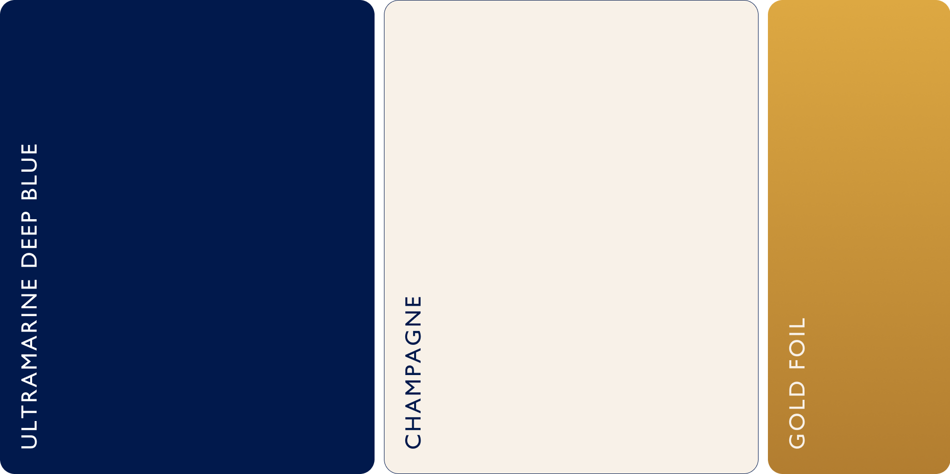
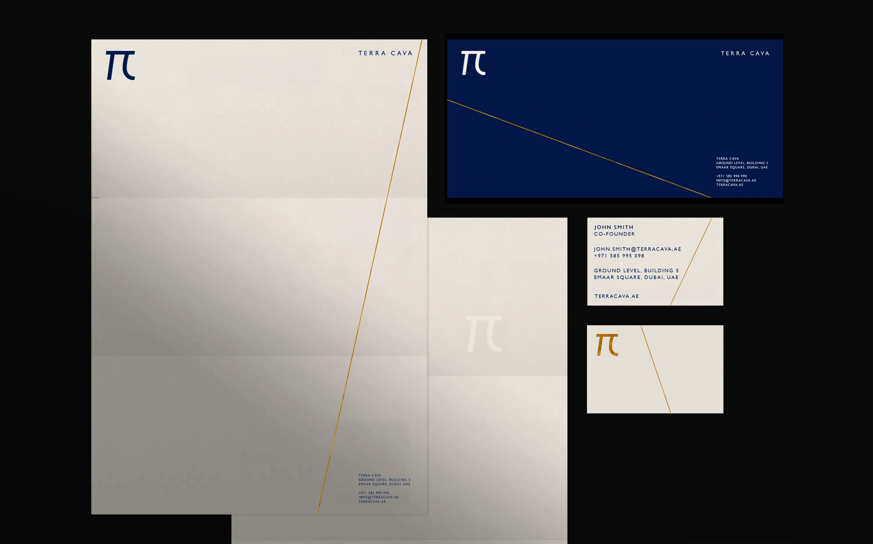
The color palette was designed to feel understated and luxurious. Ultramarine deep blue provides depth, contrast, and a contemporary presence, while the champagne tone softens the system and recalls the natural surfaces Terra Cava works with. The identity uses fine gold foil lines applied selectively across materials. These lines introduce precision, craft, and a sense of value without visual noise, adding a subtle architectural detail that elevates the brand while keeping the focus on proportion, material, and finish.
The Terra Cava typography system is built on a balance of clarity and refinement. Gill Sans is the primary typeface, chosen for its clean geometry, its modern character, and the quiet confidence it brings to the brand. It supports straightforward communication while keeping the tone contemporary and approachable.To complement it, the identity uses Garamond Premier Pro (GPP) as the secondary typeface. GPP introduces a sculptural elegance that aligns naturally with Terra Cava’s work.