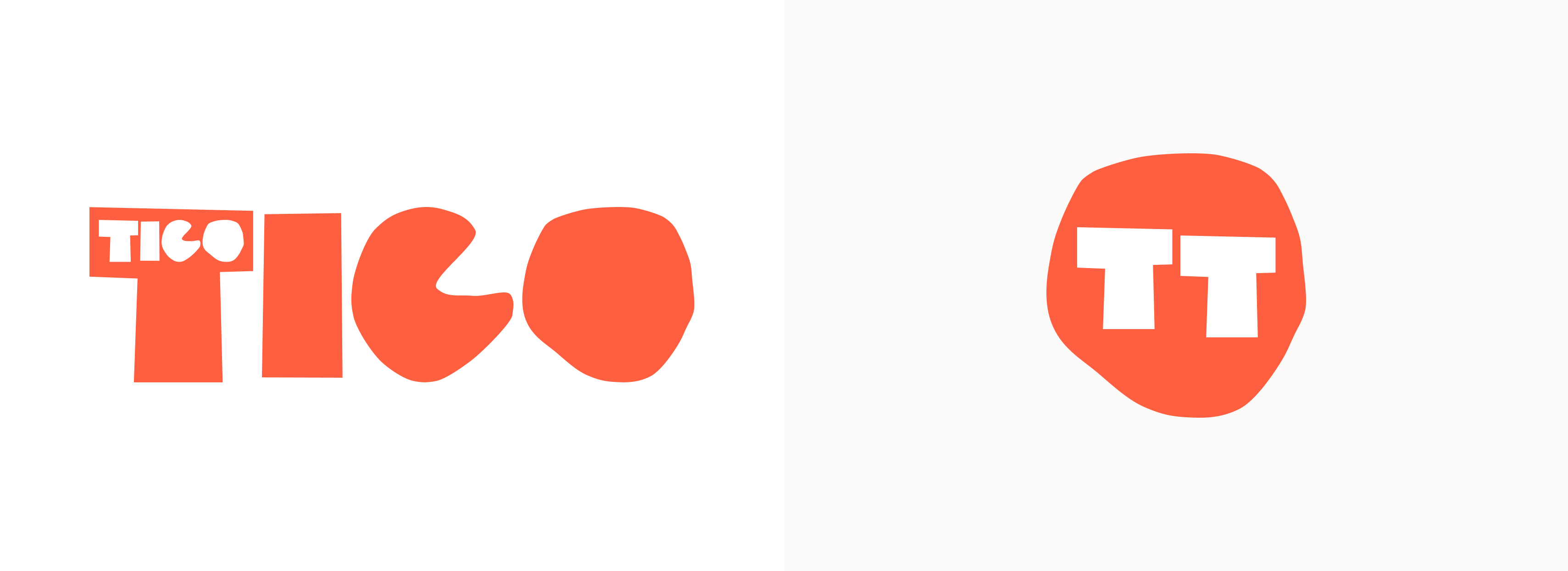
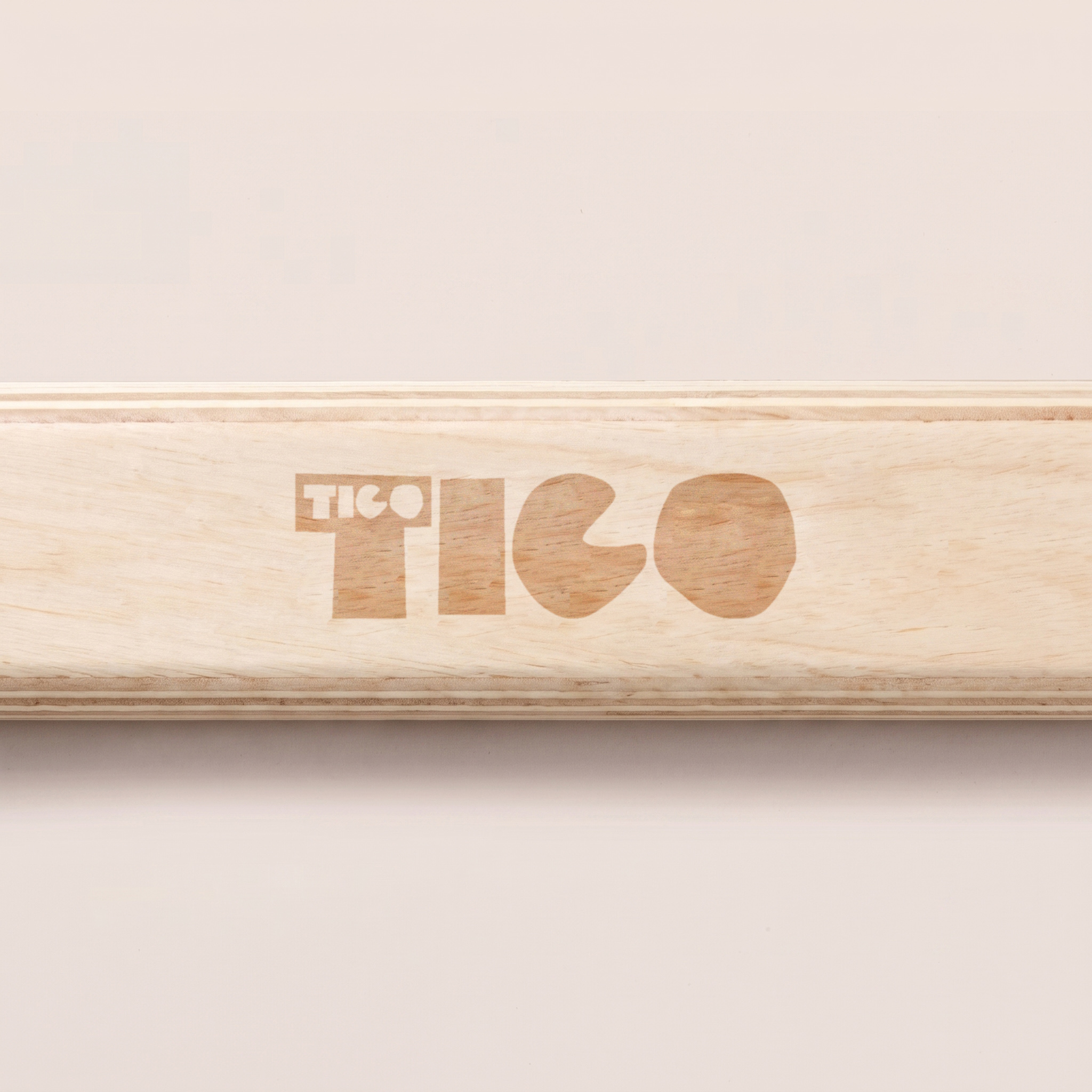
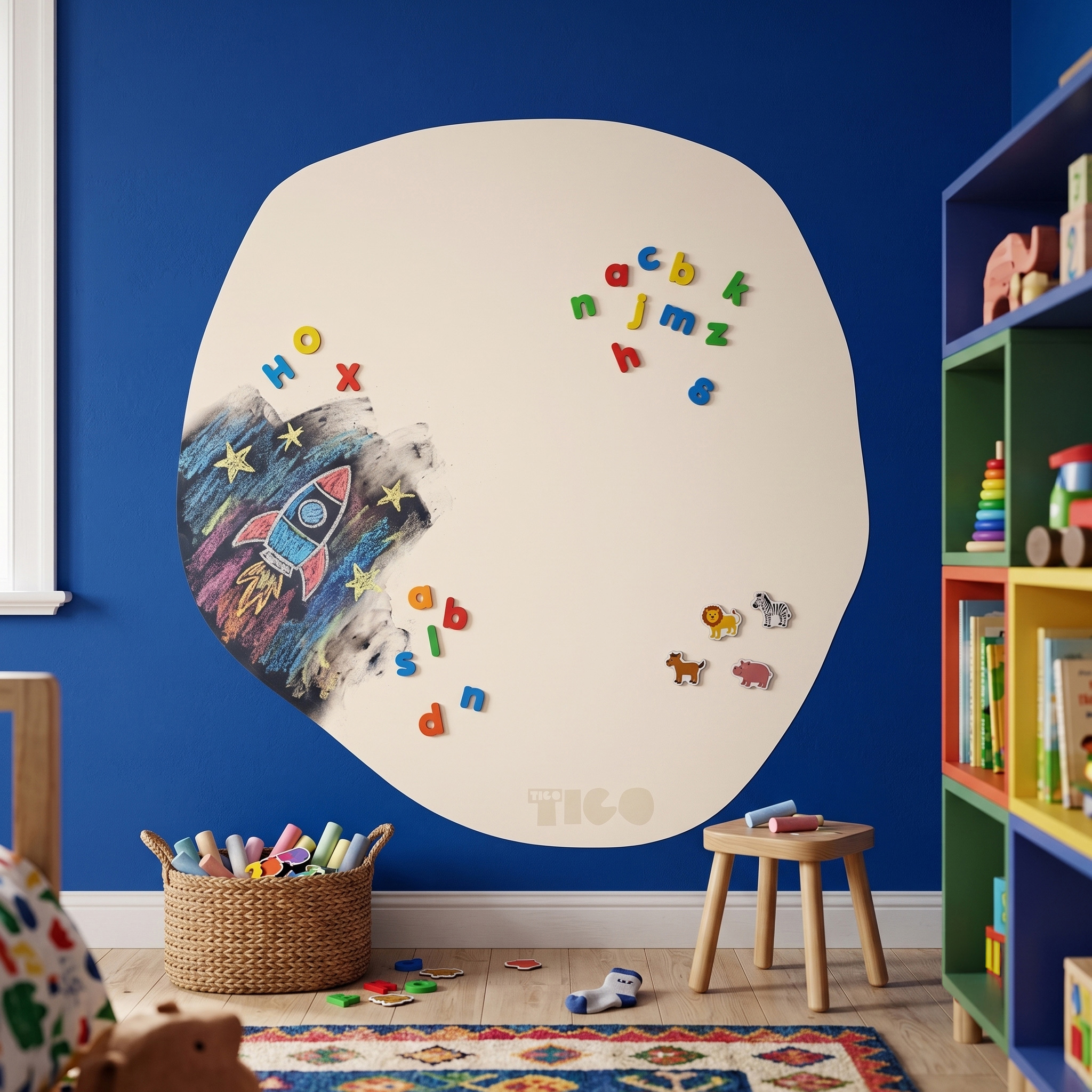

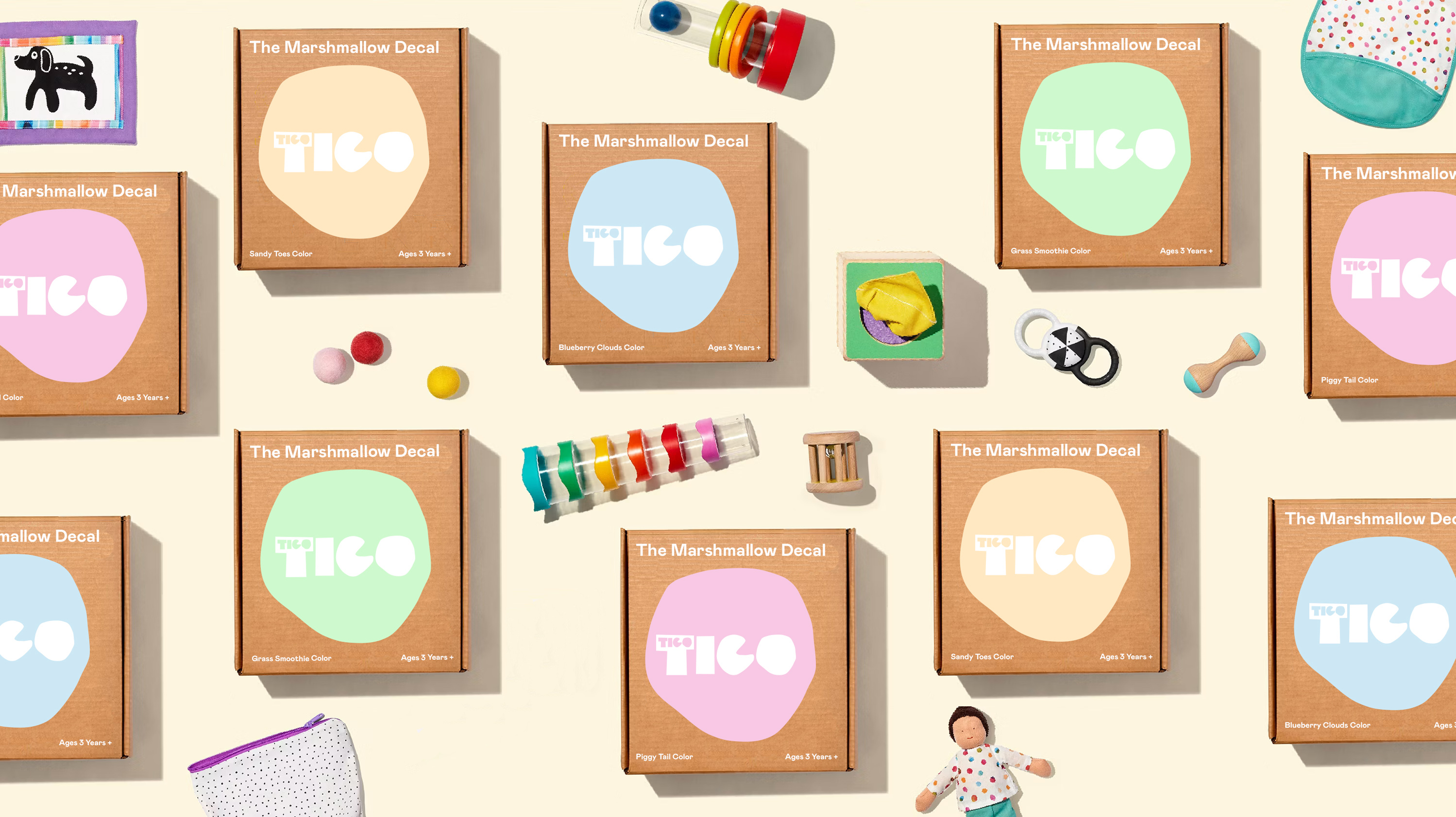
To bridge the identity directly into the physical product line, we pulled the asymmetrical "O" shape straight from the logo and used it as the physical silhouette for their launch product, The Marshmallow Decal.
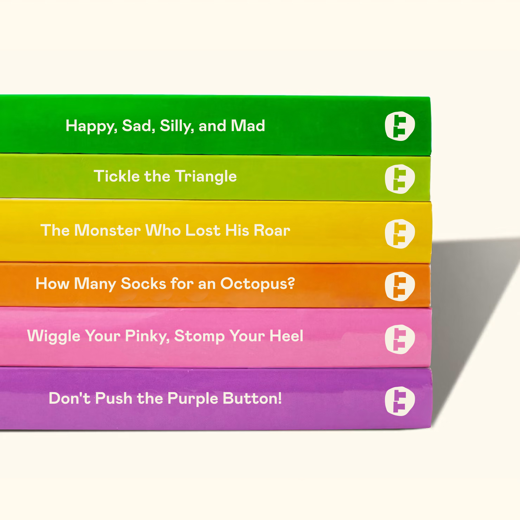
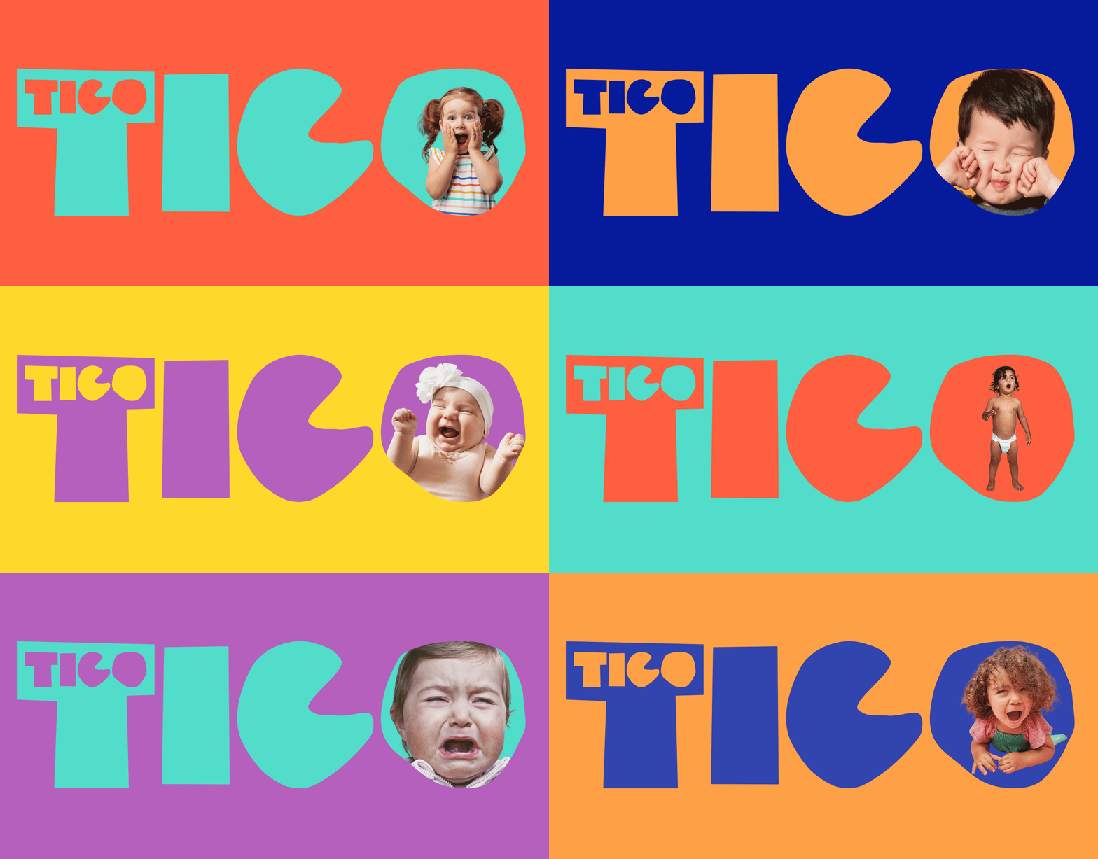
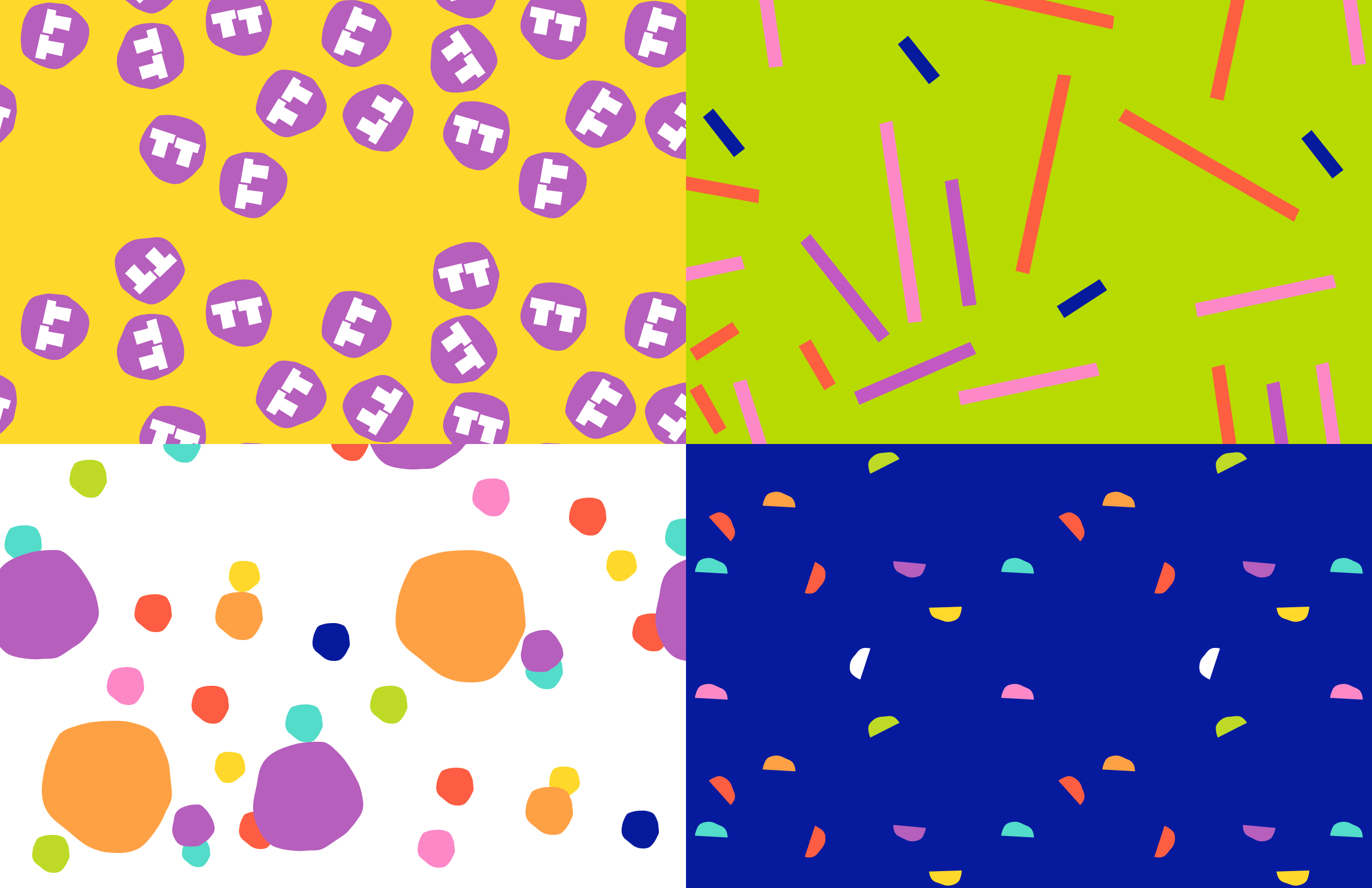
High-contrast brights pair with soft neutrals and charcoal text to deliver a playful pop while keeping the overall look clean, calm, and premium.
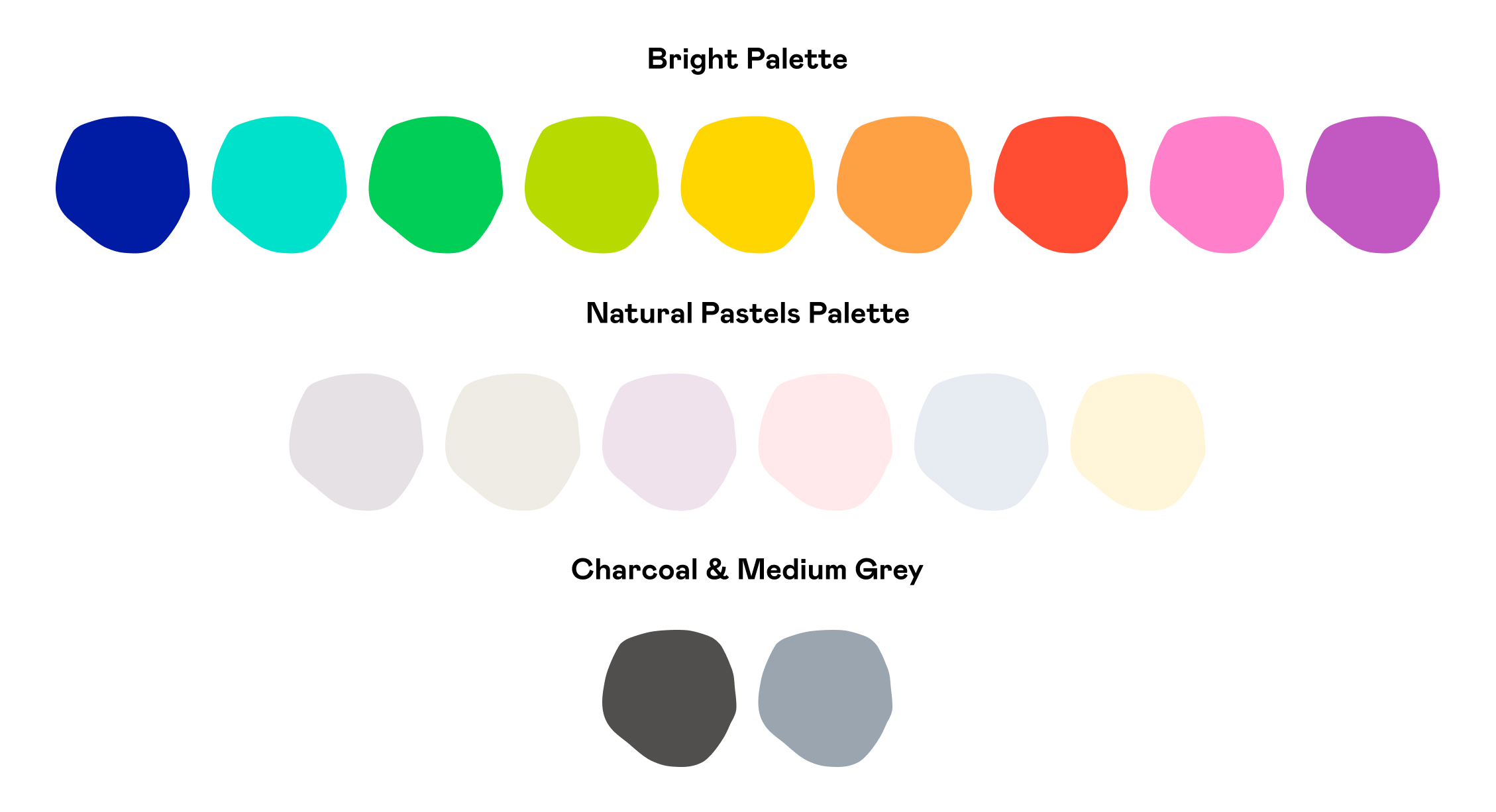
We selected Mabry Pro as the core brand typeface. Its geometric structure and subtle character give body copy a modern, approachable feel while keeping technical information crisp and easy to read across packaging and digital touchpoints.



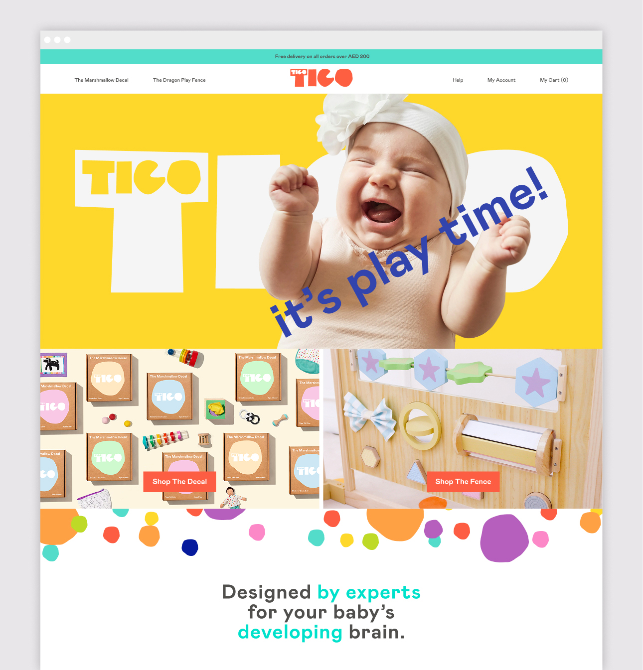
The digital storefront brings the brand to life online, using high-impact visual storytelling and intuitive navigation to seamlessly bridge product narrative with sales.